Monday, 27 May 2013
Sunday, 26 May 2013
Sunday, 19 May 2013

Friday, 17 May 2013
Wednesday, 15 May 2013

Tuesday, 14 May 2013
Monday, 13 May 2013

Sunday, 12 May 2013
Saturday, 11 May 2013
Friday, 10 May 2013
Thursday, 9 May 2013

Re design
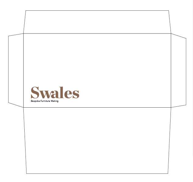
After printing the deliverables off for my architecture brief I didn't feel the colours represented the lecture series very well, with this in mind I changed all the colour to black and have found some new stock. I will be using a light grey and sand coloured stock now, this gives the project a much more appropriate feel and works better in terms of a range.
Here are the new vector files for printing.
Here are the new vector files for printing.
Wednesday, 8 May 2013
Monday, 6 May 2013
Printed range.
My full printed range for Introspective, now it's in front of me a I feel it's missing something, I am going to change the stock to grey and sand and keep the visuals black to create a minimal aesthetic. The colours is used originally didn't reflect the event or what it was about.
Sunday, 5 May 2013
Saturday, 4 May 2013
Gif.
I thought it would be nice to have a gif at the start of the website which is interactive. Which ever shape/colour you click dictates which website you go to, they are all the same layout and pages except the colour differences.


Publication further development.
The latest development with our publication, the addition of a front page and the illustrations used throughout, it still needs some refining but its starting to come together.
Thursday, 2 May 2013
Iphone.
Iphone layout completed, I said I only needed to print after this in the last post but I still need to mock all the posters into context and such.
Publication development.
Me and Will decided to scrap the culture section at the beginning as it bared no relevance to the publication and the images weren't aesthetically pleasing.
Wednesday, 1 May 2013
Website.
Now the design is completed for the promotional and event collatoral the website was fairly easy to design, especially keeping with the structured and stripped back aesthetic I've been aiming for now I need to apply this to an Iphone format, print the other deliverables and I should be done for this brief.
Tuesday, 30 April 2013
Sketch book covers.
I realised the sketch book covers were the wrong colour for each grid so I had to make amendments.
Monday, 29 April 2013
Publication.
The finished publication, I took a lot of inspiration from Typo London's conference guide as to the content, but decided to add a couple of architects. I feel by adding the architects it gives a better idea as to what the event is about, it showcases the traits of essential minimalism and the introspective design it holds.
Sunday, 28 April 2013
Publication spreads.
Just a few variations of the publication layout, I'd like to keep the design very minimal and the typography structured with no unnecessary or fancy graphics.
Friday, 26 April 2013
Architecture Foundation.
A wee bit of online promotion, nothing special just an article on 'the architecture foundation's' website, I havnt completed the article but the graphic is there with a short description of the event.


Thursday, 25 April 2013
Final Nametag.
Keeping the design the same as the tickets to maintain consistenacy within the smaller formats, here are the name tags, I now need to print them and laminate them. Forunately I still have Typo London's name tags which have a handy clip on them. All I need to do is hole punch the laminated name tags and they're done.
Layout tests.
Now Will has provided me with some illustrations I started experimenting with layouts, In all honesty I think the publication would work much better if it were all illustrations, Wills work looks really nice and fits in well with the content.
Wednesday, 24 April 2013
Final ticket.
The final design for the ticket, with the grid applied according to the type of ticket, student/adult/senior. I think the difference in aesthetic works well and creates a greater over all aesthetic for the brand.
Tuesday, 23 April 2013
Final Flyer.
The final design for the flyers, I thought it would be quite nice to using a part of the grid to add a little extra to the design, I stated earlier I thought it was missing something and I think this could be it. Other than that I wanted to keep the flyer design similar to the poster as they performed the same function. Really happy with the result especially the new touch, I will now apply this to the rest of the brand and I think a Gif of the changing parts of the grid would look really nice as the first page for the website.
Publication images.
Initial versions of the publication with images, I've no doubt once Will has completed the illustration they will replace a lot of the images but I wanted to get an idea of how the type sits at the minute with images.
Monday, 22 April 2013
Layout tests.
Now I have gathered some of the information for our pyramid publication I wanted to experiment with a few layout ideas, As the content later on in the publication is more about sacred geometry I tried to keep the layouts structured and fairly similar throughout the book. I still need illustrations from Will to use instead of some of the imagery, it will give the publication a more rustic feel and mix up the content.

Sunday, 21 April 2013
Type.
We decided to use Clarendon as the typeface for the headers, due to slab serifs being related to Egyptian typography. We wanted to use hieroglyphs for the icons running along the top of the page also, specific ones to represent what the chapter was about.
Univers was chosen for the body copy as there is a lot of type within the book, mainly information based which needs to be delivered clearly.


Univers was chosen for the body copy as there is a lot of type within the book, mainly information based which needs to be delivered clearly.


Saturday, 20 April 2013
Books Marks.
Adding another simple item to my range, book marks, can't go wrong with these, every body uses them and they'll always come in handy. Again keeping the aesthetic running through but a little different to break it up a bit.
Sketch book.
Adding a sketch book to my range of deliverables for Introspective, the idea came to me after thinking back to Typo London. They gave tote bags away with various items in them such as book marks sketch books, and other additional books. Really easy add on for my range and a nice break from what I have so far. I did a few cover tests earlier and thought this was gave the book a nice balance, I would be nice to have similar but different covers for this and the conference guide
Pagination.
Having sorted out the chapters for our book me and Will did a quick pagination sketch, the chapters will be;
- Intro
-Culture
- Mythology
- How they were built
- Intricacy of design
- Other theories

- Intro
-Culture
- Mythology
- How they were built
- Intricacy of design
- Other theories

Friday, 19 April 2013
Cover tests.
Experimenting with a few layout designs for the front cover of the 'conference guide' for Introspective, this cover will also be used for the sketch book. Again I want to vary the application of the brand whilst maintaining the same aesthetic.
Thursday, 18 April 2013
Final Posters.
Final poster designs, with the chosen colour ways. I've applied the colour to a specific grid, so orange for the + grid, blue for the squares and green for the circles. The colour choice has been made due to the colours being simple and easy on the eye, pastel colours seem more fitting for this project as vibrant colours would create a lot more visual noise. I will also use the different grids to represent adult, senior, and student tickets/nametags.
Wednesday, 17 April 2013
Printed Tickets.
More test prints, this time the tickets I feel the strip along the bottom works best as it varies the brand and doesn't keep the same static visual across the range.
Printed Posters.
After printing the posters out I've decided to stick with my initial choice and keep the centre grid as it's simple without as much visual noise as the others.
Tuesday, 16 April 2013
Name tag test.
A few name tag design variations, trying to apply the brand varied over my range, increasing the size of the grid to give the brand a wider aesthetic. my favourite is the single strip along the bottom, this also works really well with the tickets. The colours aren't correct for these yet but I will apply them properly once I've chosen which one I'll use.
Monday, 15 April 2013
Tickets test.
These were a pain to design, changing format is like entering a foreign country, this being a format I've never worked with before either, any way I'm quite happy with some of these. I'm going to print out the variations to get an idea of which is more appropriate. I'm really happy with the way the grid interacts with the QR code on some of them.
Sunday, 14 April 2013
Colour.
Experimenting with a few colour variations, I'm liking the green orange and blue combination, the purple seems to feminine and the red to bold.


Saturday, 13 April 2013
Publication cover.
Having been to Typo London last year it was a great bit of past primary research, if there's such a thing which gave me a chance to see what a lecture series would be branded like. Having said that a great deliverable would be a publication running the audience through lecturers, schedules and other any other information they might need. I thought I would be designing more publications this module but a couple of my briefs ended up becoming more than just that so this is a great opportunity to get some layout design in. The covers are my favourite variation of the grid so far, I'm not sure which one I prefer so I'm going to print them out to get a better idea.
Postcard Vectors.
With the last batch of postcards looking a little bland and considering the vector imagery on the invoices and letterheads working so well, I felt applying that aesthetic to the postcard would help a lot. It breaks up the page, brings in a new aesthetic and balances the postcard, I just wish Richard had more projects photographed so I could mock up more. I'm going to get some stock images from the internet to mock the final postcard series up.
Friday, 12 April 2013
Postcard Image side.
A few variations for the reverse side of the postcard containing a full image of the project with the title and logo, The reverse side will have a close up and a short description of the project. I really like the format I'm working with, it allows me to create nice visuals on a budget with high impact. I had a talk with Richard a few days ago and he loved the idea.
Postcard variants.
As Richard will constantly be updating his 'portfolio' or publication I decided to create a pack in which his work is showcased in post card formats rather than a publication, this allows him to change it when nessecary and also makes it very easy for me to create new additions when needs be. This format is a very cost effective way of approaching the problem as it wont have to be bound and can easily create a high impact sophisticated look.
These are some variations of the post card, I have been working with a copy writer here at the beautiful meme which has been brilliant in refining context for this brief. working with professionals in general here has been a huge help, I haven't received an ounce of positive feedback once but thats what I love about it, they never tell me what to do but instead constantly make me question the decisions I'm making about the brief.
These designs are based more so on the initial message when opening the promotional pack, as of yet I'm unsure weather this will be something Richard will give out or something he can keep on his person to show clients if they approach him.
Wednesday, 10 April 2013
Flyers test.
Beginning to apply the designs to other collateral, fairly similar design to the posters, but trying to vary the grid across my range in order to create a wider brand. To be honest I'm still happiest with the standard layout it's structured and straight to the point no 'visual noise' or over complication. I still need to add another aspect to the design to round it all off, it seems like it's missing something.
Invoices.
Applying the logo and aesthetics to the invoice, as I said earlier I need to find an aesthetic to apply to my range. I like the idea of using simple vectors of his work, particularly his floating shelf, I love the curves it creates and I think it works with the logotype really well.
Tuesday, 9 April 2013
Colour variations.
After selecting my preferred layout I wanted to test different colour variations, I'm still leaning toward pastel colours as it seems more fitting with the designs, greys and other natural colours seem to obvious and lack the impact of the colour. The audience is students also which will be much more attracted to vibrant designs.
Letterheads.
Experimenting with letterhead designs, I need to find an aesthetic I can carry across the brand. With the WA being the focus of the logotype I feel it could be applied across my range but people may confuse the WA for being his initials. I'll be printing these out later to see which is more appropriate.
Monday, 8 April 2013
Business Card Annotation.
My range of business card variations I much prefer the logo centralised but slightly larger than on my printed ones. I would like to emboss the business card to add a bit of sophistication to the project as Richards audience is 40 - 60 year olds.
Sunday, 7 April 2013
Business Card test.
A small selection of business card layouts from InDesign, I'm will be printing the full variations out to annotate them shortly, I have experimented with Richard within the logotype just to see how it sits on a business card but I doubt it will be used for the final design.


Saturday, 6 April 2013
Type & Image 2.
More variations of the promotional posters for the event, trying different compositions with the layout of the grid and applying more type, personally I don't think the extra type or varied layouts work. I was much happier with the solid layouts and composition, this isn't an event that should be focusing on non conformed design, it should be stripped back the same as the Architecture.
Type & Image.
Testing the new grids on posters with the information of the event, really happy with some of these I want to keep the design structured and simple to maintain the Swiss aesthetic, I'm going to fix up the designs a little by moving the graphic up and trying some type on the bottom so the artwork doesn't seem to fall off the page.
Finalised Logotype.
Finally got around to refining the logo and really happy with the result, I will be showing Richard mid week to see how he feels about it. Hopefully he'll be happy with it and no problems, now to start apply the logo and building a brand.


Friday, 5 April 2013
Promo pack.
A few initial sketches for different ways of delivering Richard's promo pack, I need to find a cost efficient way as he doesn't have much money. The idea of a postcard pack that doesn't need to be bound seems more fitting and its something the client can hold and flick through to.
Chosen Logotype.
Having spoken to Richard we decided the Swales alone would work best, the two differences in flow of the type doesn't match and looks a bit mix and matched. I'm really happy with the subtlety of the link between the letters and think it represents Richards work. Looking at the three different weights I feel bold works best, now I just need to refine the logotype.


Thursday, 4 April 2013
Refined grid.
As stated in an earlier post the other grids were to all over the place (for want of a better word), this approach gives a more solid design to the project I have yet to apply type to any of these as I'm in a rush but I'm sure this will work much better. The type I'll be using will be considered and applied in a structured manner, I'm unsure of colour as of yet I'm thinking pastel colours to give an authentic feel, again similar to that of 60s-70s design.
Information which will be needed is;
- Name of event (Introspective)
- time/date
- location
- price (where to buy tickets also
- what the event is (architecture lecture series)
Information which will be needed is;
- Name of event (Introspective)
- time/date
- location
- price (where to buy tickets also
- what the event is (architecture lecture series)
Logotype.
Having reviewed my logo ideas, I feel these two are the strongest for both Richard and Swales. Although I feel Swales works best alone, for I think the flow of the C to the H in Richard represents more of a liquid substance. I'm going to have a meeting with Richard later this week in which I will ask him which he prefers.


Wednesday, 3 April 2013
Merged grid.
Playing around with the grid I created in compositions with some initial type over them. I like the grid but I don't feel I've been applying it properly, it feels very mix and matched which is nothing like the swiss style, the artwork needs to be more solid and considered. I'll need to refine the grid and create some variations also. The type doesn't seem to work either, I'm going to use either helvetica or Univers LT Std as these were used a lot within international typographic design.
Tuesday, 2 April 2013
Introspective poster
Using circles in the designs instead of the squares, this doesn't seem to fit as well I think the square designs contain more structure and seem more graphic which is more what this project is about the typeface doesn't seem to work either. I will experiment using the grid but with a more solid designs I feel the circle over complicates the design.
Monday, 1 April 2013
Flyers test 2.
Playing around with more flyer tests, this time with them stickin to a similar design to the posters, at first I thought it would be nice to use the same graphics but I like the idea of having the graphic corresponding to the size order of planets and suns. The bigger deliverables having sun graphics and smaller ones having planet graphics.
2nd Grid.
After researching patterned grids and other similar artworks I decided to try combining 3 seperate grids which when aligned properly form a solid. This represents the perceptual therapy in chaos, by shifting the grids away from each other I create 5 different patterns, with the solid centre being the minimal houses within the chaotic cities. I really like the visuals this creates, the solid simple graphic fits in with the swiss typography style I want to create for this brief.
Chaos.
Going off the quote 'perceptual therapy in chaotic surroundings' I wanted to create a posters that juxtaposed the two, showing some form of chaotic artwork which held a calm centre that the type/information could sit in. This is one idea I have been developing, I'm not really happy with the outcome but using a grid chaotically is an idea I'm fond of for this project. I'll get back to the sketch book to see if anything else comes to mind.
Saturday, 30 March 2013
Swales. Digital development.
Playing around with a few variations corresponding to the idea that Richards work has a natural flow within it, I wanted to create a natural flow between some of the letter forms. I felt it would be easy to achieve more variations on the computer than by hand, these are some I have so far.
Friday, 29 March 2013
Rs Logo sketch.
Playing around with a few logo ideas, seeing if any thing comes, I'm liking the idea of connecting the letter forms together but I'd like to experiment with his full name more and 'Swallow' which he said was his nickname.
Thursday, 28 March 2013
Poster test.
With the posters being the bigger out of the deliverables they should have suns as the graphic, and the flyers have planets as the graphic due to them being a smaller deliverable I played around with a few variations of layout and I really like the suns sat off the page slightly.
Wednesday, 27 March 2013
Tree Trunks
Playing around with some negative space designs I've had in mind. Due to Richard having certain hidden elements to his designs I wanted to try and incorporate this into the logo type, I don't think it's worked very well as you cannot tell it's supposed to be a tree. I want to experiment with more ideas relating to his work with the natural form of the wood.
Tuesday, 26 March 2013
Copy writter.
I've been working with a copy writer this week at the beautiful meme which has been really interesting, it gave me a cool insight into how the meme goes about developing a brand identity. Plus working with these developed 'positions' gives me more to work with visually.


Zen.
Seen as though zen is such a huge influence for my selected minimal architects, I wanted to do a bit of research into symbols which represent Zen and it's back ground. I'm not sure what I can do with the information collected so far, but I'm sure it will come in useful along the way.
Zen is a school of Mahayana Buddhism that developed in China during the 6th century as Chán. From China, Zen spread south to Vietnam, to Korea and east to Japan.
The word Zen is derived from the Japanese pronunciation of the Middle Chinese word 禪 (dʑjen) (Modern Mandarin: Chán), which in turn is derived from the Sanskrit word dhyāna, which can be approximately translated as "absorption" or "meditative state".
Zen emphasizes the attainment of enlightenment and the personal expression of direct insight in the Buddhist teachings. As such, it de-emphasizes mere knowledge of sutras and doctrine and favors direct understanding through zazen and interaction with an accomplished teacher.


Architectural Review.
Architectural Review.
The Architectural Review is a monthly international architectural magazine published in London since 1896. Articles cover the built environment which includes landscape, building design, interior design and urbanism as well as theory of these subjects.
Now, a decade into the new century, pluralism, parametricism and plagiarism reign, though the AR is still sceptical of fashions and fads, believing architecture to be, at its core, a socially responsible art.
Magazine covers.
Carefully selecting covers using mostly graphics as apposed to imagery, I have found a selection which take a considered approach to designing for architecture. They keep a fresh minimal design for each cover utilising their logo mark which interacts with the background images + colours, For my publication I will be keeping the design more minimal than these as my selected architects approach is to close the building off from it's exterior and allow the interior to hold the beauty. Creating a feeling of introspection and zen inside the buildings. As for the posters I will have a lot more freedom to advertise the event.
70s and 80s.
Starting to consider design direction for my architecture brief and after researching the minimalist movement for architecture I found this 'style' became most popular in the 70s and 80s. I would like to use this as an influence for my designs. I have found various designers from that era which create lovely minimal designs through simple forms and typography.
Burton Kramer.
Burton Kramer (1932- ) is a graphic designer who trained in the United States, pursued an influential career in Zurich, and then moved to Toronto, where he revitalized the design community with bold interpretations of the Swiss and International styles of typography and image.


Bridging the Gap.
An ongoing personal project, poster designs for Bridging the Gap.


Morten Iveland as The Infamous Press
Again not design from the era but created in the same style, some really nice pieces of design. The thing I like the most is the consistency within each piece, as I'll need to create publications for a series that have subtle differences this approach could help.


Burton Kramer.
Burton Kramer (1932- ) is a graphic designer who trained in the United States, pursued an influential career in Zurich, and then moved to Toronto, where he revitalized the design community with bold interpretations of the Swiss and International styles of typography and image.


Bridging the Gap.
An ongoing personal project, poster designs for Bridging the Gap.
Simplicity, with two core elements; consistent layout and substantial graphic.
Although these designs aren't from the 70s/80s you can see they have taken inspiration heavily from those era's with the use of solid geometric forms and considered typography, and the designs have turned out great with strong consistency. I don't want to create designs with so much similarity to the past era's but I will use them as influence.


Morten Iveland as The Infamous Press
Again not design from the era but created in the same style, some really nice pieces of design. The thing I like the most is the consistency within each piece, as I'll need to create publications for a series that have subtle differences this approach could help.


Monday, 25 March 2013
Planets exposed.
InDesign files set up to be printed so we can expose the screens soon, there are a few more for these but they will be A2 apposed to the A1 posters for the suns, this way I can fit 2 per screen and get them done faster an cheaper.
Publication.
A publication I designed to go with the posters, keeping the designs simple to deliver the information quickly. The blank circles are there for a guide to stick down die cut circles from our posters as an example of the print process used, this will give the publication a bit extra and be a nice aesthetic for the audience. I'm not happy with the cover I'd rather use a simple solid circle maybe die cut with a fluorescent insert.
Friday, 22 March 2013
Pyramids.
After doing a bit of research regarding pyramids which relate to the Orion constellation I found three major megaliths. These three sites around the world all have 3 large pyramids which are positioned in a way that represents the three stars which make up Orions belt.
The three sites are Giza in Egypt, Teotihuacan in Mexico and Xian in China, We have lots of information about Egypt and their pyramids, a small amount of Teotihuacan's and little to nothing of Xian's. Xian is very mysterious due to China not allow people to excavate or even trespass on the land as it's seen as a spiritual place.
These are aerial views of the megaliths;

Egypt's pyramids can also be seen to stretch even further to represent the Orion constellation.

Thursday, 21 March 2013
Experimenting with a few website variations, I'm really happy I chose this brief as it allows me to experiment with a passion of mine that lends simple crisp graphics and is mainly information based allowing me to use mono spaced typefaces in proper context. The website is stripped back and simple to deliver information easily and the colours are all considered to match the celestrial bodies their used for.
My preferred design is the more gridded version, where all the circles are aligned with the paragraphs.
My preferred design is the more gridded version, where all the circles are aligned with the paragraphs.
Egyptian artifacts.
Gathering more research on Egyptian culture, this time relating to artifacts, Will has alreayd researched Egyptian language (hieroglyphics).
Ankh
Only Kings, Queens, and Gods were allowed to carry this symbol. The ankh is the Egyptian sign of life and indicates that the King or God holding it has the power to give or take life away from lesser mortals. The Ankh, as a symbol of the life giving elements of air and water, was often used by a God or Goddess who holds the ankh before the Kin's nose, giving him the "breath of life" or as streams of water in the form of ankhs running over the King during ritual purification.

Scarab Beetle
The scarab was associated very early on in Egypt with the generative forces of the rising sun and with the concepts of eternal renewal. The beetle is known for coming out of the sand backwards dragging its ball of dung behind it along the ground before depositing it in underground tunnels as a source of food for its larvae, therefore symbolizing the sun’s daily journey across the heavens from East to West. Because the young beetles seemed to emerge spontaneously from these tunnels, the Egyptians worshipped the scarab under the name Khepri: “He who came forth from the earth” or “He who came into being”. Thus the beetle was equated with the creator Got Atum from early times. Scarabs thus became potent amulets and were often placed upon the breasts of mummies in the position of the heart as a symbol of new life and were then weighed against the feather of truth in the final judgment. They were usually inscribed with part of chapter 30 of the Book of the Dead.

Conopic Jars
Canopic jars were used by the Ancient Egyptians during the mummification process to store and preserve the viscera of their owner for the afterlife. They were commonly either carved from limestone or were made of pottery. These jars were used by Ancient Egyptians from the time of the Old Kingdom up until the time of the Late Period or the Ptolemaic Period, by which time the viscera were simply wrapped and placed with the body. The viscera were not kept in a single canopic jar: each jar was reserved for specific organs. The name "canopic" reflects the mistaken association by early Egyptologists with the Greek legend of Canopus.
Canopic jars of the Old Kingdom were rarely inscribed, and had a plain lid. In the Middle Kingdom inscriptions became more usual, and the lids were often in the form of human heads. By the Nineteenth dynasty each of the four lids depicted one of the four sons of Horus, as guardians of the organs.

Subscribe to:
Posts (Atom)