Playing around with a few variations corresponding to the idea that Richards work has a natural flow within it, I wanted to create a natural flow between some of the letter forms. I felt it would be easy to achieve more variations on the computer than by hand, these are some I have so far.
Saturday, 30 March 2013
Friday, 29 March 2013
Rs Logo sketch.
Playing around with a few logo ideas, seeing if any thing comes, I'm liking the idea of connecting the letter forms together but I'd like to experiment with his full name more and 'Swallow' which he said was his nickname.
Thursday, 28 March 2013
Poster test.
With the posters being the bigger out of the deliverables they should have suns as the graphic, and the flyers have planets as the graphic due to them being a smaller deliverable I played around with a few variations of layout and I really like the suns sat off the page slightly.
Wednesday, 27 March 2013
Tree Trunks
Playing around with some negative space designs I've had in mind. Due to Richard having certain hidden elements to his designs I wanted to try and incorporate this into the logo type, I don't think it's worked very well as you cannot tell it's supposed to be a tree. I want to experiment with more ideas relating to his work with the natural form of the wood.
Tuesday, 26 March 2013
Copy writter.
I've been working with a copy writer this week at the beautiful meme which has been really interesting, it gave me a cool insight into how the meme goes about developing a brand identity. Plus working with these developed 'positions' gives me more to work with visually.


Zen.
Seen as though zen is such a huge influence for my selected minimal architects, I wanted to do a bit of research into symbols which represent Zen and it's back ground. I'm not sure what I can do with the information collected so far, but I'm sure it will come in useful along the way.
Zen is a school of Mahayana Buddhism that developed in China during the 6th century as Chán. From China, Zen spread south to Vietnam, to Korea and east to Japan.
The word Zen is derived from the Japanese pronunciation of the Middle Chinese word 禪 (dʑjen) (Modern Mandarin: Chán), which in turn is derived from the Sanskrit word dhyāna, which can be approximately translated as "absorption" or "meditative state".
Zen emphasizes the attainment of enlightenment and the personal expression of direct insight in the Buddhist teachings. As such, it de-emphasizes mere knowledge of sutras and doctrine and favors direct understanding through zazen and interaction with an accomplished teacher.


Architectural Review.
Architectural Review.
The Architectural Review is a monthly international architectural magazine published in London since 1896. Articles cover the built environment which includes landscape, building design, interior design and urbanism as well as theory of these subjects.
Now, a decade into the new century, pluralism, parametricism and plagiarism reign, though the AR is still sceptical of fashions and fads, believing architecture to be, at its core, a socially responsible art.
Magazine covers.
Carefully selecting covers using mostly graphics as apposed to imagery, I have found a selection which take a considered approach to designing for architecture. They keep a fresh minimal design for each cover utilising their logo mark which interacts with the background images + colours, For my publication I will be keeping the design more minimal than these as my selected architects approach is to close the building off from it's exterior and allow the interior to hold the beauty. Creating a feeling of introspection and zen inside the buildings. As for the posters I will have a lot more freedom to advertise the event.
70s and 80s.
Starting to consider design direction for my architecture brief and after researching the minimalist movement for architecture I found this 'style' became most popular in the 70s and 80s. I would like to use this as an influence for my designs. I have found various designers from that era which create lovely minimal designs through simple forms and typography.
Burton Kramer.
Burton Kramer (1932- ) is a graphic designer who trained in the United States, pursued an influential career in Zurich, and then moved to Toronto, where he revitalized the design community with bold interpretations of the Swiss and International styles of typography and image.


Bridging the Gap.
An ongoing personal project, poster designs for Bridging the Gap.


Morten Iveland as The Infamous Press
Again not design from the era but created in the same style, some really nice pieces of design. The thing I like the most is the consistency within each piece, as I'll need to create publications for a series that have subtle differences this approach could help.


Burton Kramer.
Burton Kramer (1932- ) is a graphic designer who trained in the United States, pursued an influential career in Zurich, and then moved to Toronto, where he revitalized the design community with bold interpretations of the Swiss and International styles of typography and image.


Bridging the Gap.
An ongoing personal project, poster designs for Bridging the Gap.
Simplicity, with two core elements; consistent layout and substantial graphic.
Although these designs aren't from the 70s/80s you can see they have taken inspiration heavily from those era's with the use of solid geometric forms and considered typography, and the designs have turned out great with strong consistency. I don't want to create designs with so much similarity to the past era's but I will use them as influence.


Morten Iveland as The Infamous Press
Again not design from the era but created in the same style, some really nice pieces of design. The thing I like the most is the consistency within each piece, as I'll need to create publications for a series that have subtle differences this approach could help.


Monday, 25 March 2013
Planets exposed.
InDesign files set up to be printed so we can expose the screens soon, there are a few more for these but they will be A2 apposed to the A1 posters for the suns, this way I can fit 2 per screen and get them done faster an cheaper.
Publication.
A publication I designed to go with the posters, keeping the designs simple to deliver the information quickly. The blank circles are there for a guide to stick down die cut circles from our posters as an example of the print process used, this will give the publication a bit extra and be a nice aesthetic for the audience. I'm not happy with the cover I'd rather use a simple solid circle maybe die cut with a fluorescent insert.
Friday, 22 March 2013
Pyramids.
After doing a bit of research regarding pyramids which relate to the Orion constellation I found three major megaliths. These three sites around the world all have 3 large pyramids which are positioned in a way that represents the three stars which make up Orions belt.
The three sites are Giza in Egypt, Teotihuacan in Mexico and Xian in China, We have lots of information about Egypt and their pyramids, a small amount of Teotihuacan's and little to nothing of Xian's. Xian is very mysterious due to China not allow people to excavate or even trespass on the land as it's seen as a spiritual place.
These are aerial views of the megaliths;

Egypt's pyramids can also be seen to stretch even further to represent the Orion constellation.

Thursday, 21 March 2013
Experimenting with a few website variations, I'm really happy I chose this brief as it allows me to experiment with a passion of mine that lends simple crisp graphics and is mainly information based allowing me to use mono spaced typefaces in proper context. The website is stripped back and simple to deliver information easily and the colours are all considered to match the celestrial bodies their used for.
My preferred design is the more gridded version, where all the circles are aligned with the paragraphs.
My preferred design is the more gridded version, where all the circles are aligned with the paragraphs.
Egyptian artifacts.
Gathering more research on Egyptian culture, this time relating to artifacts, Will has alreayd researched Egyptian language (hieroglyphics).
Ankh
Only Kings, Queens, and Gods were allowed to carry this symbol. The ankh is the Egyptian sign of life and indicates that the King or God holding it has the power to give or take life away from lesser mortals. The Ankh, as a symbol of the life giving elements of air and water, was often used by a God or Goddess who holds the ankh before the Kin's nose, giving him the "breath of life" or as streams of water in the form of ankhs running over the King during ritual purification.

Scarab Beetle
The scarab was associated very early on in Egypt with the generative forces of the rising sun and with the concepts of eternal renewal. The beetle is known for coming out of the sand backwards dragging its ball of dung behind it along the ground before depositing it in underground tunnels as a source of food for its larvae, therefore symbolizing the sun’s daily journey across the heavens from East to West. Because the young beetles seemed to emerge spontaneously from these tunnels, the Egyptians worshipped the scarab under the name Khepri: “He who came forth from the earth” or “He who came into being”. Thus the beetle was equated with the creator Got Atum from early times. Scarabs thus became potent amulets and were often placed upon the breasts of mummies in the position of the heart as a symbol of new life and were then weighed against the feather of truth in the final judgment. They were usually inscribed with part of chapter 30 of the Book of the Dead.

Conopic Jars
Canopic jars were used by the Ancient Egyptians during the mummification process to store and preserve the viscera of their owner for the afterlife. They were commonly either carved from limestone or were made of pottery. These jars were used by Ancient Egyptians from the time of the Old Kingdom up until the time of the Late Period or the Ptolemaic Period, by which time the viscera were simply wrapped and placed with the body. The viscera were not kept in a single canopic jar: each jar was reserved for specific organs. The name "canopic" reflects the mistaken association by early Egyptologists with the Greek legend of Canopus.
Canopic jars of the Old Kingdom were rarely inscribed, and had a plain lid. In the Middle Kingdom inscriptions became more usual, and the lids were often in the form of human heads. By the Nineteenth dynasty each of the four lids depicted one of the four sons of Horus, as guardians of the organs.

Wednesday, 20 March 2013
Planet ratios.
Due to this brief being very information driven, we need to cover every aspect of information. Therefore the posters will have the correct ratios for the circles on the sheet. I had to work out the ratios for each planet and sun individually.


Tuesday, 19 March 2013
Flyer test.
Experimenting with layout ideas for the flyers, which I can hopefully transfer onto poster design etc. I'm not really happy with any of these as of yet, I'll have a play around with poster ideas as there's more information and it will be easier to develop a consistent aesthetic.
Friday, 15 March 2013
Tim George.
A lovely pair of minimal designs by Tim George, keeping it simple with vector outlines of the space shuttle and the Apollo 8 trip, it would be nice to have a few different prints for the more successful manned missions to space. I would like to create more of a technical aesthetic apposed to this icon style work though.
tim-george.co.uk


tim-george.co.uk


Thursday, 14 March 2013
Greetings
Another great deliverable idea, executed nice and simple again, greeting cards from 'For print only'.
Wednesday, 13 March 2013
Sun Mock
I also mocked the sun prints up to get an idea of colour, fairly simple considering they're all fluorescent, I wish we could print digitally with these colours, it would be great to have them for the rest of our deliverables.
Mock prints.
Today after readying the files for exposing I decided to mock up some colour ways we could stick to for printing, this will make it much easier to match colours etc, the tan circle in the middle represents a copper foil print.
Egyptian Culture.
Whilst searching for research on Egyptian culture and how they lived there lives I came across this brilliant website, it has ancient paintings and a description of what the painting depicts. This is perfect as it will help me complete the first chapter in our publication in no time at all.
Music and Dance
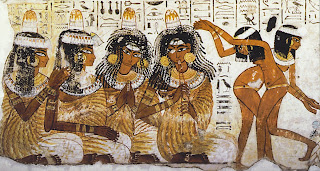
A tomb painting of two girls dancing to music made by several women. Two of the women clap their hands to keep the rhythm, another plays a double flute, and the second from the left may be a singer. The scene is found in the tomb of Nebamun at Thebes and dates to circa 1400 B.C.E. The part of the painting shown here measures about 11 3/4 inches tall.
Adorning the body

A tomb painting of a servant girl and four elegantly dressed women at a funerary banquet. The guests wear wigs, gold earrings, jeweled collars, bracelets, and pleated dresses. On their heads are scented ones of animal fat that release perfume as they slowly melt. Several women are holding lotus flowers, which were typically distributed to banquet guests as they arrived. This wall painting appears in the tomb of Nebamun at Thebes and dates to about 1400 B.C.E.
Burial Practices

A scene drawn on papyrus in the Book of the Dead that belonged to Hunefer, as scribe. Here, Hunefer's mummy is undergoing the "opening of the mouth" ritual in front of a funerary stela and a pyramid-shaped funeral chapel. The three priests at left are about to pry open the mumy's mouth so that the deceased can eat, drink, and speak in the afterlife. Two women mourn in front of the mummy, which is propped up from behind by a priest wearing a mask of the jackal-headed God Anubis. The papyrus dates to circa 1300 B.C.E. and measures about 15 1/2 inches tall.
Crafts and trade.

A tomb painting that shows craftsmen in the workshop of the Pharaoh Amenhotep III. A scribe uses a bronze bull's head to weigh rings of gold. To his right, artisans create djed pillars, which signify endurance and stability. Such pillars were covered with inscriptions before being placed in a shrine or buried with the dead. Below, other craftsmen create an inlaid box, a vase, and a sphinx. To their left, two men present finished goods for inspection, including a djed pillar and a round collar. This painting is from the tomb of Nebamun at Thebes and dates to circa 1400 B.C.E.
Domestic life.

A wall painting from the tomb of an official named Inherka. Seated at left, Inherka and his wife are surrounded by their young grandchildren, who play and hold birds in their hands. In keeping with the times, the children are naked and wear their hair very short, except for the traditional lock of hair on the side. Inherka's son stands at right and offers votive gifts to his father. This tomb is located at Deir el-Medina and dates to the Old Kingdom.
Writing and Education.

A tomb painting of scribes recording a grain harvest. Laborers scoop the grain into sacks of a standard size, and a seated official counts the number of sacks on his fingers. Scribes to the left and right record the tally on papyrus. This painting comes from the New Kingdom tomb of Mennah at Thebes.
Food and Drink.

A wall painting from the New Kingdom tomb of Sennedjem, a Theban tomb builder. He and his wife Iyneferet are shown in the afterlife, sowing and plowing the fields of paradise. Sennedjem uses a whip to drive the two spotted cows that pull the plow. Tall flax plants grow behind Iyneferet, who holds a seed basket and drops seeds into the freshly plowed soil. Below, are date palms and other trees.
Housing.

t
Medicine.

A wooden relief of the physician Hesire, who held the title Chief of Tooth-doctors and Doctors at the court of the Pharoah Djoser. Hesire was also a scribe and an official, and he is here shown holding a scribe's tool kit and the sekhem rod that is emblematic of executive officials. This wooden panel was found in Hesire's tomb at Saqqara. It measures about 45 inches tall and dates to the Old Kingdom.
Religious Beliefs

The "heart weighing" ritual drawn on papyrus in Hunefer's Book of the Dead. The scribe Hunefer is led by jackal-headed Abubis to the scale, where his heart will be weighed against the feather of truth. Crocodile-headed Amenmet waits to eat the heart, should the result condemn Hunefer. Ibis-headed Thoth records that Hunefer has passed the test, and falcon-headed Horus presents him to Osiris, Isis, and Nephthys for final judgement. The papyrus dates to circa 1300 B.C.E. and measures about 15 1/2 inches tall.
Social Classes

A tomb painting showing people of several social classes during a grain harvest. At the top, winnowers toss the grain with wooden scoops to separate the kernels from the chaff, and a laborer presents samples of the cleaned grain to the master for inspection. In the middle, laborers haul nets full of grain heads, and two girls pull each other's hair as they compete to pick up grain that has fallen to the ground. At the bottom, inspectors use rope to measure the crop and determine how much grain the government should receive. This painting comes from the New Kingdom tomb of Mennah at Thebes.
Warfare

A painted side panel from a wooden chest found in the Pharaoh Tutankhamun's tomb. The scene shows the massacre of the Nubians by Tutankhamun, who rides in the large chariot. He is followed by troops and by slaves who fan him. The panel measures 18 1/2 inches tall and dates to circa 1352 B.C.E.
Tuesday, 12 March 2013
ByKato.
The Danish furniture design studio byKATO wished to reinforce their Scandinavian roots and a design philosophy called ‘Everyday object solutions’. In this case, we created logo, visual identity and the overall creative direction for the brand.
The furniture designs created ‘byKato’ are unlike any of the previous designers, therefore the brand identity is and reflects the practice. With all the previous identities we have found natural colours and structured logo forms. ByKato creates simple structured forms with a wide range of colour choice, sometimes giving the furniture a plastic feel. This aesthetic is carried across through the use of different tints of teal and a more playful friendly design. The identity represents a product which would sit comfertably in a family home.


Mathew Hilton
Matthew Hilton is one of the most important and influential modern furniture designers in the UK, having established his reputation working for the likes of Habitat, SCP and Case. This identity was designed to support the launch of his own critically acclaimed personal range of furniture. The bold nature of the marque reflects his strong idiosyncratic vision.’


Subscribe to:
Posts (Atom)